When there are more questions than answers, we are all looking to understand what is actually happening. But we also know that even if we want to carefully analyze the situation and cause-effect relationships, we might not possess enough reliable information to draw conclusions. So what should we do in this case?
To get the answers we’re looking for we can evaluate the current situation and form future expectancies and forecasts in order to understand how to plan our lives and what direction should we move towards.

What will you find in this article?
- A brief description of the available data sources.
- Notes on the use of data.
- Visualization of available data on coronavirus (+ demographic and economic indicators) in PowerBI (InsightWhale).
- Notes on working with the PowerBI file.
- Brief info on the slides (lot’s of pictures and some text).
- What can be learned from these charts and how to use them.
What is available for review?
Data source examples:
- Johns Hopkins
- Official organizations websites, such as:
- Twitter accounts of official organizations, such as:
Always pay attention to what data source is used in reports, graphs or visualizations!
Sometimes you’ll meet data that’s not confirmed in any way by the country’s officials (for instance, the media says that women over 65 die more frequently than men, but the said country did not give out any information on the sex-to-age mortality ratio from coronavirus).
Unofficial resources may simply hypothesize rather than analyze validated data. Moreover, even if an analysis did take place, there’s no guarantee the analytical methods were applied correctly (sometimes an analysis can produce paradoxical results, such as – “the higher the population density, the lower the infection rate”).
It is important to understand that:
- Not all countries provide precise information. For example, in Italy, you can find a breakdown of data by cities and demographic indicators, while in Kazakhstan, there is only a general number for the whole country.
- Not all countries have the required number of tests for coronavirus, respectively, real quantitative indicators may differ from what is displayed on media or the Internet.
- Data on the general demographic (sex ratio, mortality, etc.) and economic (national debt, import, export, etc.) indicators in the public domain can be found in limited quantities and often dates back to 2015-2017.
- It also takes time to collect and post statistics, so in general, the data that we see on websites is at least one day behind.
Thus, even when we use data from official sources, we will not be able to see the real picture in the whole world, therefore we should always keep in mind the assumption that the current state of events can be somewhat worse or much better.
PowerBI Coronavirus Data Visualization
Here at InsightWhale got together and brainstormed on the topic of coronavirus, looked at the available information, and visualized the collected data. Visualization does try to define the occurring events as good or bad, but simply describes the current situation. By using these graphs and tables, you can draw your personal conclusions, I will only describe possible uses and provide notes.
General notes
- Reporting needs to be loaded, give it some time (it is right after this block in the iframe).
- The PowerBI report is updated daily and even if the screenshots in the article are out of date, the report is not.
- In the upper right corner you can see the latest date of data update and the sources used.
- In the lower right corner, there is an icon, which when you click on it will expand the report to full screen.
- The second icon on the bottom right -> share the URL, is there so you can copy the link and send it to friends or share it on the social media networks.
- Go to the bottom middle to switch and flip through report pages.
- The report gets constantly updated, so new sheets may be added or minor adjustments may be made to the current ones.
- To select several countries at the same time, use Ctrl + left mouse button (Windows) or Cmd + left mouse button (Mac).
General information

You can apply the filter on the right (and select one or several countries) to find out the coronavirus numbers for a specific country.
- Confirmed: the number of confirmed infections, including recovered, and deaths, and those who are still infected.
- Recovered: number of patients who got infected and cured.
- Deaths: number of patients who got infected and died.
- Increased today on: how many cases have been added today (on the day the data is updated).
- Confirmed vs Population: coefficient of the significance of infection relative to the population of the entire country; the number of confirmed cases divided by population.
- Recovered vs Confirmed: recovery rate, the number of recoveries divided by the number of confirmed cases.
- Deaths vs Confirmed: mortality rate, the number of deaths divided by the number of confirmed cases.
- The map answers the question: in which countries do most people recover relatively infected?
Want a data visualization like this one?
Contact InsightWhale and we’ll create custom data analytics dashboards for you 😌
Statistics for countries with 100+ coronavirus infected
The slides below display only those countries that obtain more than 100 coronavirus infected cases. You can select one or more countries to display on the chart and filter what’s being displayed by a specific date or the number of days. Statistics for countries with over 30 million in population.

How is it useful?
This graphic starts from a single point – cases that show more than 100 infected in a given country. If by using calendar days we can monitor the current situation, then here we can see the relative course of the incidence by country. For example, we can see that on the 20th day in the USA the indicators are already significantly higher than the Chinese ones and the incidence rate itself is generally sharper than it was in China.
What to rethink and where to dig deeper?
Of course, you can ask your own questions (feel free to write them in the comments, I will gladly think them over with you), but here are a couple of options:
- What actions were taken by China for 20-21 days (while initially, China had a long leap, the situation stabilized afterwards, the US is not able to stabilize the situation quickly)?
- What did the USA do or did NOT do in comparison with China on the 14-15th day (after the growth went up more swiftly)?

The same graph as above, but using calendar days.
How is it useful?
- Here you can see specific dates and look more precisely for information on the actions of states during one or another change in quantitative indicators.
- You can see the correlation between the charts of different countries, for example, Italy and Spain have the same drawdown on March 12, and then the charts move in parallel. Having found such interesting points, we can go deeper and analyze the actions of countries in pairs.
What to rethink and where to dig deeper?
- What did China do on February 12?
- What happened in Italy and Spain on March 12?
- What happened in the States on March 18?
- Will the US healthcare system withstand this situation?

This graph is similar to the ones above but shows the effect of the number of coronavirus infections on the country’s population, the graphs are reduced to a single point (when a country got more than 100 infected). Statistics for countries with 30M + population.
How is it useful?
- Understand which countries experienced the greatest impact on the population and the health system due to the coronavirus outbreak.
- Notice the relative effects of the coronavirus infection. The numbers you see can be huge, but it is only a small fraction of the population or vice versa. Or perhaps the quantitative indicators will be low in comparison to other countries, but this counterintuitively will bring enormous damage to the state.
What to rethink and where to dig deeper?
- In terms of quantitative indicators, China was the initial leader, but surprisingly, the damage done to the population from 5+ days in other countries is much higher. This is how we recognize countries that need the biggest help and urgent operational measures at the government level.
Calendar rate of mortality and recovery
The ratio of mortality and recovery to the number of infected.


How is it useful?
You can understand how the situation in a particular country is changing for recovery or mortality on days, which mark registering more than 100 infected.
What to rethink and where to dig deeper?
The first graph shows that in the US mortality exceeds recovery, but the situation in Italy, for example, is the complete opposite. Understandably, the desired outcome is when more people recover and fewer people die. Accordingly, in the United States, something very wrong is clearly happening.
If at some point these graphs change places, you can analyze which actions were performed and which measures were taken by the country, or try to look for a more detailed breakdown by demographic indicators (for example, it is hypothetically possible that in some country there was a high percentage of elderly people among infected, who have a greater risk). Unfortunately, such data for each country is difficult to find.
General data by country. Table.
You can see the TOP countries for various indicators and select any groups for a deeper analysis. All countries are taken into account, including those with less than 100 infected and a population of less than 30 million.

How is it useful?
Sorting countries by the effect of infection on the population. And it would seem that at the top there should first be countries with a small population, but on the contrary, Italy and Spain are in the top five.

How is it useful?
This data visualization graph is sorted by the recovery rate.
Hypotheses:
- Countries with low quantitative indicators and a high recovery rate: a) do not give world organizations data on the actual number of infected b) perform the right actions (isolation, closing borders, etc.)
- Countries with high quantitative indicators and a high rate of recovery are doing everything right and you can analyze what they did/are doing.

How is it useful?
Where do those infected with coronaviruses die the most in relation to the number of cases? It is likely that if only 1 out of 2-3 patients has died, then the country does not give out all the statistics.

How is it useful?
The effect of mortality from coronavirus on the country’s population. Tiny numbers, but if we are talking about a pandemic and many are panicking, I think it is worth knowing these Death vs Population indicators. It is also important to further study the overall mortality rates from other diseases in the past years.
General demographic data by country
Country selection filter is located in the middle of the report header.
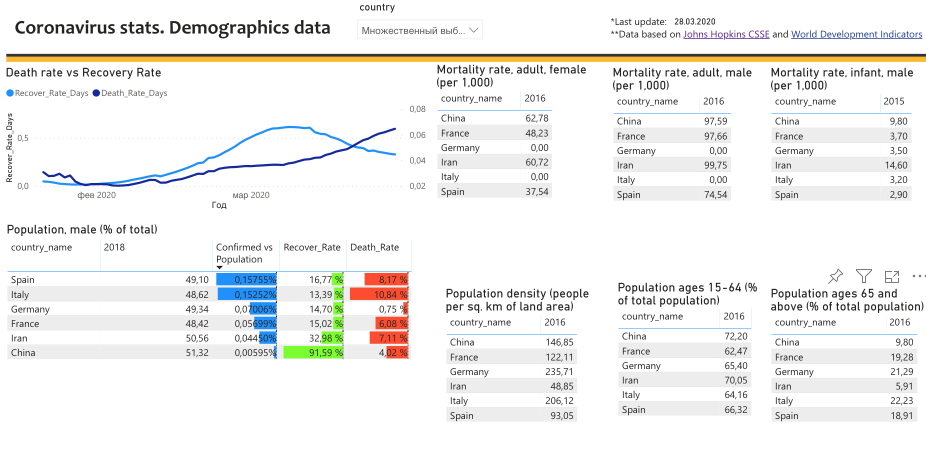
How is it useful?
There are various hypotheses on the Internet, among which is the one that says countries with a high percentage of 65+ or more men, etc., become infected faster. Demographic data for countries in open sources are available only for 2016, on this graph you can select several countries and compare them by demographic indicators.
Unfortunately, no exact conclusion can be drawn at this level. To determine the effect of demography on mortality or recovery from coronavirus, you need to have data specifically on infected patients, and only a few countries share such information.
General economic indicators by country

How is it useful?
The same graph as above, but with economic indicators, not demographic ones. There are hypotheses that the coronavirus is the third world war and that some countries deliberately infect others for some political and economic reasons. The country indicators are showcasing data for the past three years so that you can see the overall dynamics.
You can select a group of countries, analyze their indicators and probably find some insights. I think that this data can also be used to determine how critical the situation with the coronavirus will be for the economy of a given country.
Сonclusion
InsightWhale will continue collecting and analyzing data, and if we have any useful findings or insights, we will definitely share them with you. But for now, let’s do the following:
- stay calm,
- think,
- take care of ourselves and our loved ones,
- follow recommended actions (from the government), say, regarding self-isolation.
In most countries, the situation is not threatening at the moment, so it’s worth keeping it at this level and not allowing the course of events similar to those we observed in the graphs of the USA and Italy.
Stay healthy, our friends!

